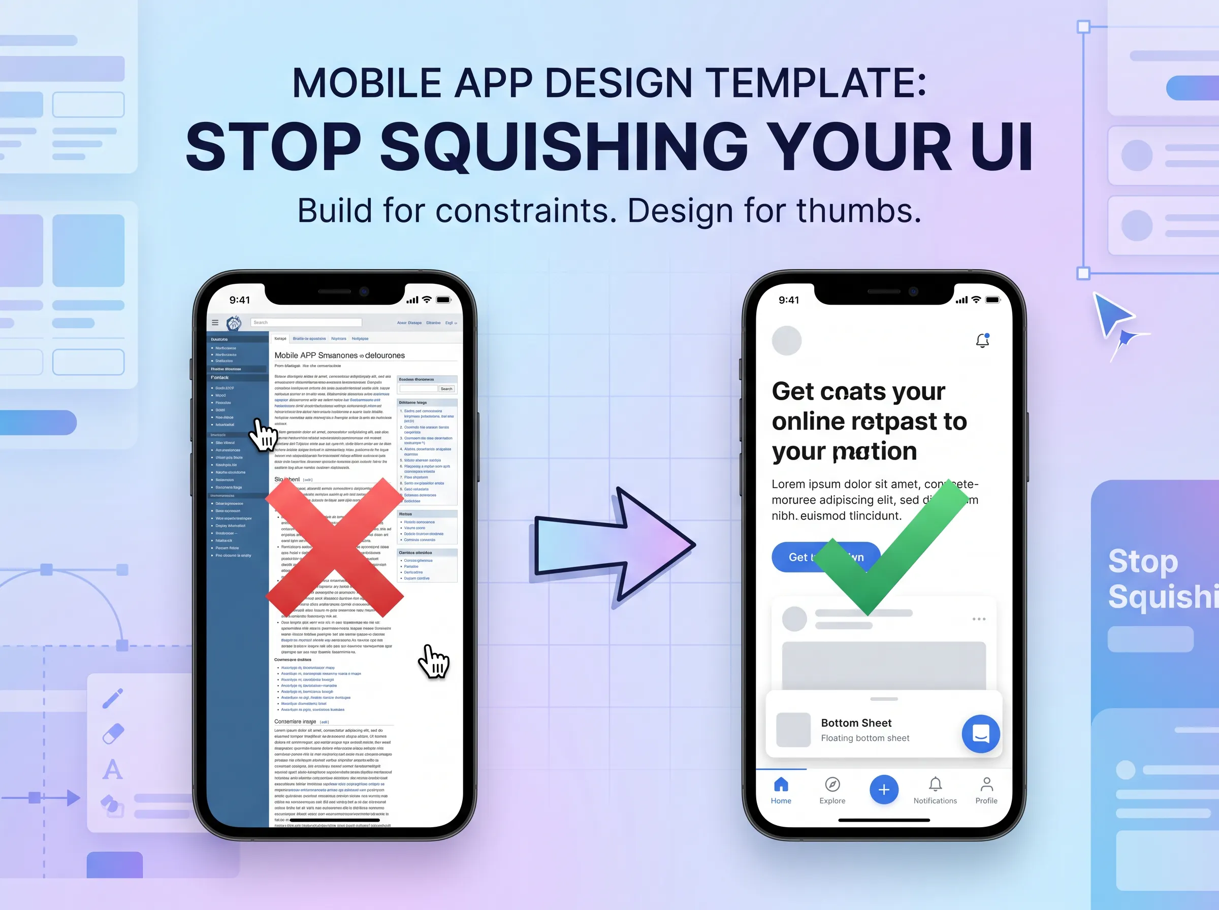
Stop Squishing Your UI: Build a Mobile App Design Template That Actually Works

Most designers who sit down to design their first mobile screen make the same mistake: they treat it like a small desktop. Same sidebar, same two-column grid, same information density. Then they zoom out and wonder why it looks cramped and confusing. A solid app design template is not just about aesthetics. It is about understanding why mobile behaves differently and building around that from the start.
Mobile Is Not Shrunken Desktop
iOS has a base font size of 17px. macOS has a base of 13px. That single fact breaks a lot of assumptions. On mobile, things often get larger, not smaller, even though the screen has shrunk considerably. The text needs to be readable at arm's length, with a thumb hovering nearby, on a screen that is physically smaller than a paperback book.
This is why mobile vs desktop layout is not really a scaling problem. It is a rethinking problem. On desktop, you might have an action bar, a gallery of recent items, a full calendar, a task list, and a scratch pad visible at the same time. On mobile, you pick one. That is the constraint. And once you accept it, the design decisions get a lot clearer.
Content hierarchy on mobile also works differently. Desktop designs can extend in two directions simultaneously, two columns here, three rows there. On mobile, you choose one direction per section: either items stack vertically or they scroll horizontally off-screen. You cannot do both at the same time in the same space, at least not without confusing the person using it. Keeping content flow unidirectional within each section is one of the most useful guidelines to carry into your first few mobile screens.
The Right App Design Template Starts With Navigation
The sidebar you had on desktop does not exist on mobile. You have two realistic options.
The first is a bottom navigation bar. If you can reduce your primary links down to three or four icons (five at the absolute maximum), a floating bottom bar works well. Keep touch target size at or above 44px, because thumbs are wider than cursors. The bottom navigation bar also changes based on context: when you open a note editor, the standard nav icons disappear and editing-specific actions replace them. This is intentional. Contextual action visibility keeps the screen focused on the task at hand rather than exposing everything at once.
The second option is turning the sidebar into a homepage. This is what Notion does. When there are too many important items to compress into five icons, a dedicated home screen shows recent items at the top, counts and quick actions to the right, and clears the bottom for a large search bar or primary action button. It feels less like a navigation compromise and more like a feature.
A bell icon and an overflow menu at the top are reasonable starting points, but those top-bar actions should also change depending on what screen you are on.
How Layout Rules Change When the Screen Gets Smaller
One principle worth committing to early: one screen does one thing. The settings screen is just settings. The note editor is just a note editor. You do not throw in suggested templates or recent items at the top because it distracts from the primary task. If a user needs something new, send them to a new screen, not a new section crammed into the current one.
This principle also has a practical side effect: it forces you to be deliberate about every element you place. Because you cannot have five things on screen, the thing you do show needs to be the right thing.
When content needs to spill beyond a single screen, swipe gesture navigation is often the answer. Swiping right to go back is so deeply ingrained on iOS that users expect it without instruction. When you animate the background moving left at roughly 35% while the new screen slides in, the transition feels smooth rather than jarring. Screen transition animation is part of how the interface communicates structure, not just decoration.
👉 Also read: iOS App Development: What You Need to Know Before You Build
Building Blocks: Cards, Text, Images, Inputs
Strip away the floating menus and contextual actions, and most mobile screens are built from four things: cards, text or links, images, and inputs. Cards do the heaviest lifting because they group related content without relying on whitespace, which is scarce on a 390px-wide canvas.
A card-based layout lets you create visual separation flexibly. A note preview, a task row, a calendar event — these are all just cards with different content inside them. The rule to watch for: avoid double-nesting cards. Card inside a card creates padding inside padding, and the usable space shrinks fast. When you feel the urge to wrap a card in another card, see if whitespace between items does the same job.
Beyond cards, keep your touch targets above 44px on every interactive element. Buttons, list items, icon taps — if a finger cannot reliably hit it, it is broken regardless of how good it looks. A floating action button for the primary action (adding a new note, starting a new task) is a common pattern here, and it works because it keeps the main CTA visible without cluttering the rest of the screen.
Typography matters more on mobile than people initially expect. Because the screen is small, you have less room to establish hierarchy with spatial separation. Type size, weight, and color have to do that work instead. Larger headings, clear label text, and restrained use of secondary colors are what separate a screen that reads easily from one that requires effort.
Gestures, Bottom Sheets, and Actions That Appear When You Need Them
This is where mobile starts behaving like its own medium rather than a constrained version of desktop.
Bottom sheets solve a specific problem: the user is in the middle of something and needs to interact with a secondary element without losing their place. Say someone is editing a note and wants to apply a template. Navigating away to a template picker would break the editing context. A bottom sheet slides up from the bottom, shows a search bar, a list of templates, a confirm button and an X, and lets the user complete the action and return to where they were. They are dismissible with a swipe down, which pairs well with the gesture-based navigation patterns users already know.
The bottom sheet pattern typically zooms out the background slightly as it appears and zooms it back in on dismissal. That small animation makes the transition feel grounded rather than abrupt.
Long press is the mobile equivalent of a right-click. The typical treatment blurs the rest of the screen, highlights the pressed element with a slight zoom, and reveals a contextual menu. iOS takes it further with a live preview of the content, which adds a layer of interactivity that makes the interface feel more responsive. This is contextual action visibility in practice: actions appear when they are relevant, not before.
The plus button is another good example of this pattern. Tapping it might reveal a small action menu or immediately open a keyboard input. Neither requires the user to navigate away. Both feel immediate.
Swipes are reliable on mobile as long as you teach users how to use them at least once. Swipe up to search (similar to how Slack handles it) is a pattern that saves screen real estate by hiding search until it is needed. Once a user learns it, it is faster than tapping a search icon and waiting for an animation.
Empty States Are Not an Afterthought
Every screen you design has two states: one where it has content and one where it does not. Most designers spend all their time on the first state and forget the second.
The first login experience is the clearest example. The screen has nothing in it yet. You could populate it with empty card outlines and instructional text, but that creates visual noise without solving anything. A cleaner approach is a full-screen empty state that draws attention directly to the primary action, a plus button, with a brief popover explaining how things work. One action. One message. The user knows exactly what to do.
The second type of empty state is the search result that returns nothing. This one needs a bit more thought. Just saying "no results" is not enough. The empty state should acknowledge what was searched, surface a couple of alternative suggestions in case of a typo, and provide a clear way out, usually an action button or a way to clear the search. Imagery helps here too. A well-designed empty state with a relevant illustration turns a dead end into an understandable moment.
Where to Find Inspiration and Free Templates
If you are looking for real-world references while working on a design, a few places are worth bookmarking.
For free mobile app design templates for beginners, Figma's community page has a large library of UI kits and screen templates. Many of the best app design templates free in Figma are contributed by working designers, so they reflect how real apps are structured rather than theoretical exercises. An app design template free download on Figma typically includes pre-built components: cards, navigation bars, bottom sheets, and input fields.
👉 Also read: Flutter Web Blurry Images: A UX Disaster Nobody's Talking About Enough
For mobile app design inspiration, Dribbble is the obvious starting point for polished visuals, but it skews toward concept work that sometimes ignores real constraints. Mobin is more useful for practical reference: it curates actual app recordings and user flows from products like Notion, Slack, and others, organized by screen type and UI element. If you want to see how a real team handled their onboarding flow or how they designed a bottom sheet, Mobin lets you filter specifically for that. Pinterest works for early mood-boarding but is less useful for studying interaction patterns.
Uizard is worth mentioning for beginners who want to generate a rough wireframe before committing to a full Figma build. It uses AI to sketch out screen layouts from a description, which is good for getting unstuck. Canva has some mobile UI templates too, though they tend to be more presentation-ready than design-ready. UX Pilot is another AI-assisted option that generates mobile UI screens and is particularly useful for rapid ideation when you need mobile app UI design ideas for beginners and do not want to start from a blank canvas.
For mobile app design inspiration websites for designers who want to go beyond Dribbble, Mobbin and Pttrns both focus on real app screenshots organized by pattern and category. These are the references I reach for when I need to validate a layout decision against how established products handle the same problem.
Studying real mobile app design examples from apps you already use is also underrated. Open Slack, look at how the search experience works. Open iOS's camera app, notice how actions appear and disappear contextually. You already have hundreds of well-designed examples on your phone.
Frequently Asked Questions
How to design a mobile app from scratch if you have never done it before?
Start with navigation. Decide whether you have enough primary links to fit a bottom bar or whether a homepage-style navigation makes more sense. Then pick one screen to design in full before touching others. The note editor, the settings screen, something with a clear single purpose. Get comfortable with the constraints of that screen before worrying about how everything connects.
What are the best free resources for mobile app UI design ideas for beginners?
Figma's community section is genuinely the best starting point. Search for "mobile UI kit" and you will find dozens of free, well-structured files. Beyond that, Mobin and Dribbble are useful for seeing finished work, and Uizard or UX Pilot can help if you want to generate a starting wireframe quickly.
How to design mobile UI step by step without getting overwhelmed?
Work in this order: navigation pattern first, then the primary screen, then secondary screens, then edge cases like empty states and loading states. Do not skip the edge cases. They are small to design but painful to encounter as a user when they are missing or broken.
Should I use Figma or another tool for my first mobile UI project?
Figma is the right call for most people. The component system, auto-layout, and community templates all make it the most practical option for designing screens that need to communicate spacing and hierarchy clearly. If you are looking for an app design template Figma file to start from rather than building components from scratch, the community library has good options for free. Canva or Uizard are fine for early exploration, but you will eventually want the control Figma gives you.
What is the biggest mistake beginners make in mobile UI design?
Trying to fit too much on one screen. The instinct to add more content, more actions, more context is understandable, but mobile forces you to choose. One screen, one purpose. As soon as you start adding a secondary action panel or a contextual sidebar equivalent, the screen stops making sense. When in doubt, make a new screen instead.
The honest takeaway here is that most mobile design principles are about accepting constraints rather than fighting them. Once you stop trying to replicate a desktop layout on a smaller canvas and start designing for a thumb-driven, one-handed, context-switching device, the right decisions start to feel obvious. Start with navigation. Commit to one action per screen. Use bottom sheets and gestures to handle complexity without clutter. And always design the empty state before you call a screen done.
Get CodeTips in your inbox
Free subscription for coding tutorials, best practices, and updates.
More from CodeTips

I Built a Habit Tracker iOS App in One Week With Zero iOS Experience: Here's What I Learned
Xcode rejected my mental model about four times before I stopped fighting it. Coming from years of full stack web work, I expected iOS App Development to feel like learning a new framework. It doesn't. It feels like learning a different trade.

Flutter Web Blurry Images: A UX Problem Developers Ignore
Why Flutter's approach to web rendering produces fuzzy, pixelated visuals that leave users deeply unsatisfied and why it matters for your product.