Website Wireframes Explained: How to Plan Any Site Before You Design It

Most designers skip wireframing and go straight to picking fonts. That decision alone is responsible for more redesigns, wasted client meetings, and scrapped layouts than almost anything else in the web design process. Website wireframes exist precisely to stop that from happening.
What a Wireframe Actually Is (And Isn't)
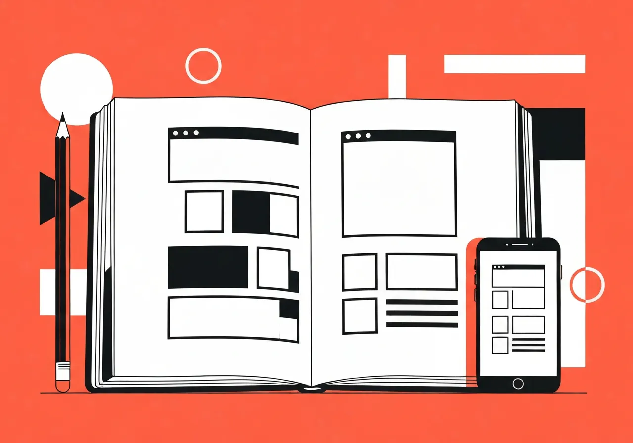
A wireframe is a stripped-down blueprint of a web page. No colors, no typefaces, no polished images. Just boxes, lines, and placeholder text that show where things go and what role each element plays.
Think of it as the skeletal framework of a design. You are not asking "does this look good?" You are asking "does this make sense?" Those are two very different questions, and mixing them up early in a project is where most design work goes sideways.
The goal is content structure planning: deciding how many headings a page needs, where the call-to-action sits, how many images are actually necessary, and what the user reads first. Navigation design, information architecture, the sequence of sections — all of that gets sorted at the wireframe stage, before a single gradient is applied.
This matters more than most beginners realize. The moment you open a design tool and start choosing a color palette, your brain switches into a different mode. You start reacting to how things look rather than whether the page is saying the right thing. Wireframing forces you to settle the "what" before you touch the "how it looks."
👉 Also read: What Is UI Design and How It Shapes Every Website
Start With Pen and Paper. Seriously.
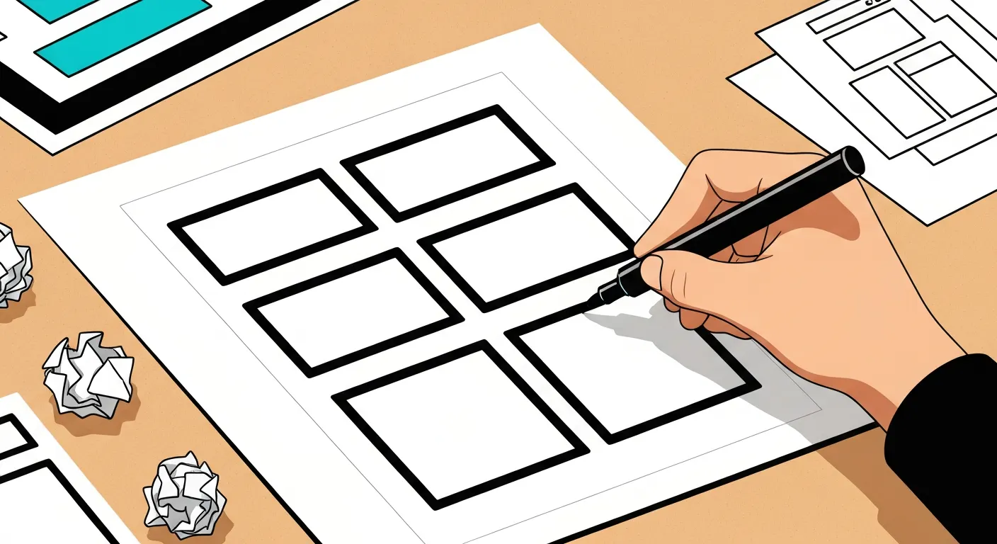
Pen and paper wireframing gets dismissed as old-fashioned. It is not. It is still the fastest way to get an idea out of your head and onto something you can react to.
When you have a notebook open, there is zero friction. No file to create, no tool to select, no template to load. You sketch a rough page layout in under ten seconds. Cross it out. Sketch another version next to it. Try a completely different structure. Do all of that in two minutes.
That speed matters because the first layout you think of is almost never the best one. The real value of pen and paper is that it makes iteration nearly free. You are not attached to anything you have drawn because it took almost no time to draw it.
The rule is this: even if you plan to build a polished digital wireframe later, start with at least a few rough sketches first. Jumping straight into a UI component library or a drag-and-drop builder constrains your thinking to whatever components the kit happens to include. You start designing around the tool instead of around the problem.
Sketching first keeps your thinking open. Then, once you have a direction you believe in, you take it to the screen.
When to Take Your Sketches Digital
There are two situations where moving from paper to a digital wireframe is worth the extra time.
First: you are working with a client. This is the biggest one. Sharing a photo of a notebook sketch with a client works, but a cleaner digital mockup communicates intent more clearly. More importantly, it signals that you are still in "structure mode" — not visual design mode. When clients see a polished-looking file, they comment on fonts and colors. When they see boxes and placeholder text, they focus on whether the content and flow are right. That is the conversation you want to have first.
Second: the page is genuinely complex. If you are mapping out a multi-step user flow, a checkout process, or a dashboard with several states, a digital wireframe helps you think through the interface element arrangement more carefully than a quick sketch allows.
For personal projects where you do not need anyone else's approval, a digital wireframe is often optional. A solid paper sketch followed by going straight into the actual design can work fine. The paper sketch still happens. The digital middle step is situational.
The broader point is that wireframing for web design is not a single step. It is a phase, and how long you spend in that phase depends on how many people need to align before you move forward.
👉 Also read: The Complete Web Design Workflow for 2026
The Best Tools for the Job
If you are moving to a digital wireframe, you have a lot of options. Here is an honest look at the main ones.
Platforma is a premium UI kit available for Figma, Sketch, and Adobe XD. It is one of the most comprehensive wireframe component libraries available. The components are all rendered in a single neutral color (a muted blue by default, which you can swap out), so there is no temptation to start adding visual design. You copy the components you need, arrange them into a page structure, and share the file. If you are billing client work and want to present clean wireframes fast, Platforma earns its cost.
Figma is where most teams work now. If you want to build a wireframe from scratch in Figma, there are community-published Figma wireframe kits that cover most standard components. Figma's sharing and commenting features also make it straightforward to send a client a link and collect feedback without exporting anything. If you want to know how to create a website wireframe in Figma specifically, the short answer is: use a wire kit from the Community tab, build your frames on a canvas, and share a view-only link.
Balsamiq is the tool that was built specifically for low-fidelity wireframing. Everything looks deliberately rough, almost hand-drawn. That is intentional — it makes clients less likely to fixate on visual details because the format itself signals "this is not final." If you are presenting to stakeholders who have a history of giving premature visual feedback, Balsamiq's aesthetic does some of the expectation-setting for you.
Sketch is still widely used in macOS-based design teams, and it has a solid ecosystem of wireframe plugins. Adobe XD has wireframing capabilities built in, though its community development has slowed. Miro is a good option if your team already uses it for collaboration — you can build rough wireframes directly on a shared board alongside notes and user flow diagrams.
InVision and tools like Canva can handle basic wireframe-style layouts, though neither is purpose-built for this stage of the process. For quick internal mockups where fidelity does not matter much, they get the job done.
For free options, InVision's published wireframe kit is solid. It covers most of the standard components you would need for a typical website without costing anything. If you are looking for free website wireframes to start from rather than building from scratch, search for community-shared Figma wireframe templates — there are hundreds, and many are genuinely good.
The best free wireframe tools for designers tend to be the free tiers of Figma and Balsamiq, plus community-contributed kits. Figma's free plan is enough for most individual designers and small teams.
Using Wireframes to Get Client Sign-Off
The client feedback process is where wireframes pay for themselves most visibly.
Here is the problem they solve: clients react to whatever they see. If you show them a half-finished design with placeholder images and rough typography, they will give you feedback on the images and typography. They cannot help it. That feedback pulls you into revision cycles on work that was never meant to be reviewed yet.
A wireframe for client approval short-circuits this. When you present a page as a grey-scale structure with boxes where images will go and real (or near-real) text in the content areas, the conversation stays on-topic. Is the headline right? Is the call-to-action in the right place? Does the page tell the right story in the right order? Those are the questions you need answered before you spend hours on visual design.
One practical note on text: using actual content in your wireframes, rather than lorem ipsum, makes a noticeable difference. Real headlines and real body copy let you and the client judge whether the page is actually working. Lorem ipsum filler hides problems that only show up when real words are on the page.
Once the client approves the structure, you move into visual design with a clear brief. No structural surprises halfway through. That alone cuts revision cycles significantly on most projects.
👉 Also read: UX Design Patterns That Actually Improve Conversion
Low-Fidelity vs. High-Fidelity: Which One Do You Need?
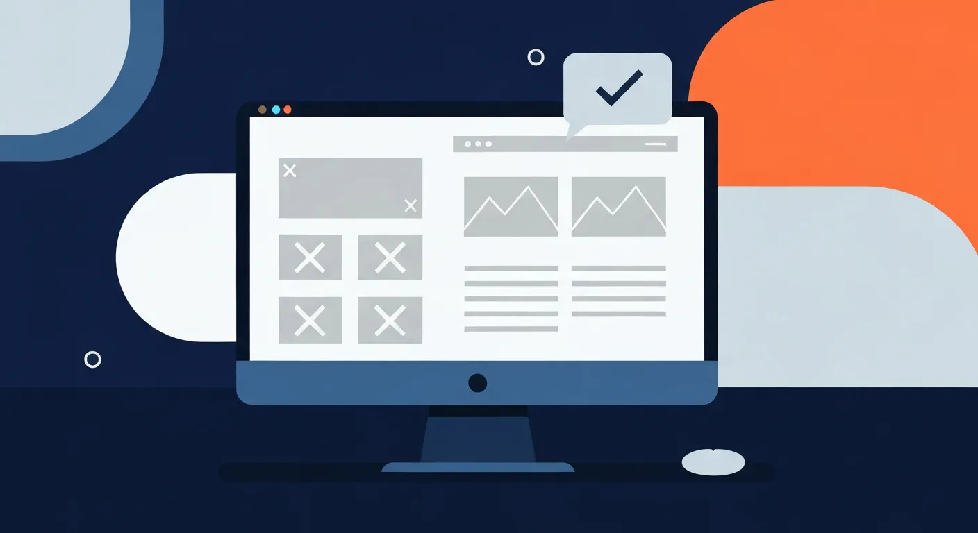
Low-fidelity wireframes are rough. Hand-drawn sketches, boxes with X marks for images, placeholder text, no visual styling. Their purpose is speed and exploration. You use them when you are still figuring out the structure.
High-fidelity wireframes are closer to a real design but still stripped of color and visual styling. They show real content, precise component placement, and accurate spacing. You use them when you need someone else to review and approve the structure before you move to the visual design phase.
The mistake is thinking you always need the high-fidelity version. You do not. If you are a solo designer working on your own project, a rough sketch followed by going directly into the actual design is a completely valid workflow. The iterative design process does not require every step to be formalized.
The real question is: who needs to understand this page before you commit to building it? If the answer is just you, a sketch is enough. If the answer includes a client, a developer, or a stakeholder who is not inside your head, a cleaner digital wireframe is worth the time.
For mobile wireframe design specifically, the same principles apply. Sketch the mobile layout separately from desktop. Navigation and content structure behave differently at smaller screen sizes, and catching those differences at the wireframe stage is much easier than redesigning a finished layout.
You can see strong website wireframes examples from tools like Dribbble and Platforma's own showcase. Wireframe examples for mobile app layouts are especially useful to study — they show clearly how much content gets cut, reorganized, or reordered when you move from a wide layout to a narrow one.
Frequently Asked Questions
How to wireframe a website for beginners?
Start with paper. Draw a rectangle for the browser window, then sketch where the header, main image or hero section, content blocks, and footer would go. Use X marks for images and squiggly lines for text. The goal is to get the structure out of your head so you can look at it and react to it. Do not worry about precision. A rough sketch that takes two minutes is more useful than no sketch at all. Once you have a few versions on paper, pick the one that makes the most sense and refine it.
Is there a website wireframe template free that is actually useful?
Yes. Figma's community section has a large number of free wireframe templates, some of which are genuinely comprehensive. InVision also released a free wireframe kit that covers most standard UI patterns. The catch with any template is the same one mentioned earlier: starting from a pre-built template can constrain your thinking. Use templates to speed up execution once you know what structure you want, not to figure out what structure you want in the first place.
Do I really need to wireframe if I am working alone?
Honestly, it depends on the project. For a simple four-page site with a clear brief, you might go from a two-minute sketch straight into design without much friction. For anything with multiple page types, user flows, or complex content, skipping the wireframe stage usually costs more time than it saves. You end up doing structural thinking inside the design tool, which is slower and messier than doing it on paper. The sketch does not have to be elaborate. Even a rough one helps.
What is the difference between a wireframe and a mockup?
A wireframe focuses on structure: where things go, what content is present, how the page flows. A mockup is a high-fidelity visual representation of the design, including color, typography, and images, but without interactivity. Wireframe first, mockup later. Confusing the two leads to wasted effort, especially in client projects where you want structural approval before committing to visual direction.
Can I use Canva or Miro for wireframing?
You can, but they are not purpose-built for it. Miro works reasonably well if your team already uses it for planning and you want to keep wireframes alongside notes and user flow diagrams in one shared space. Canva is better suited for design production than for wireframing. For anything beyond very basic sketching, Figma or Balsamiq will serve you better and give you more of the component vocabulary you need.
Pick one project you are sitting on right now and spend fifteen minutes with a notebook before you open any design software. You will be surprised how much faster the actual design goes once the structural thinking is out of the way. That is the whole argument for wireframing, and it holds up every time.
Get CodeTips in your inbox
Free subscription for coding tutorials, best practices, and updates.
More from CodeTips
10 UX Design Patterns Every Developer Should Know (And When to Skip Them)
Most developers first encounter design patterns the same way: they google a problem, find an intimidating class diagram on Refactoring.Guru, and either copy it wholesale or close the tab forever. Neither is the right move. UX Design Patterns and their software engineering counterparts are worth understanding on your own terms, because knowing when not to use them is just as valuable as knowing what they do.
What is UI Design? The Honest Beginner's Guide to How It Works
Most people who use apps and websites every day have no idea how much thought goes into a single button. The color, the size, the spacing, the way it responds when you tap it that is UI design. Understanding what is UI design and how does it work is the first step toward either appreciating the craft or building a career in it.
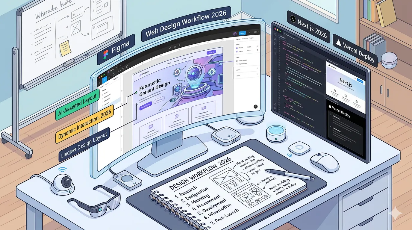
Complete Web Design Workflow for 2026
Master the complete web design workflow for 2026 from discovery and wireframing to build, testing, and launch. Step-by-step guide for modern teams.